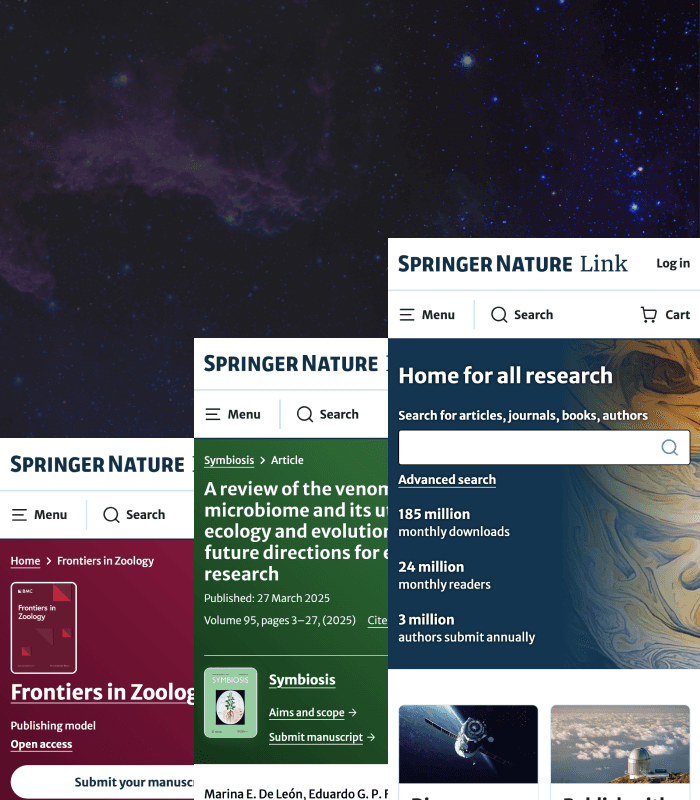
Redesigning the article page

A redesign of SpringerNature's article page making dense scientific content easier to scan, understand, and act on through validated design decisions.

Role

UI designer

Industry

Publishing

Duration

6 months • 2024

Overview

SpringerNature is one of the world’s leading academic publishers with over 1M daily users. This article page redesign is focused on improving discoverability, open access clarity, evaluation speed, and submissions while staying true to strong branding and UX fundamentals. As UI Designer, I applied validated UX research, insights and testing results from the preceding researcher centric platform design concepting stage into clear, usable, and visually coherent interfaces.

Take a look at an article page!

Take a look at an article page!

Wait, what is Open Access?

Open Access is a publishing model with free to read research. SpringerNature boasts thousands of open access articles, journals and books.

Features

Key features improved visual hierarchy, navigation, and calls to action so users could evaluate articles and discover content with ease.

Mobile experience

Key features

Impact

The design delivered measurable gains across engagement, revenue, and discoverability without harming core performance metrics.

+21%

+21%

Article purchases

Article purchases

+19%

+19%

Log-ins

Log-ins

+13%

+13%

Authentication

Authentication

+47%

+47%

Journal traffic

Journal traffic

+5%

+5%

Downloads

Downloads

+5%

+5%

Downloads

Downloads

Problem

Users struggled to find key information, understand open access content, and move confidently between products due to poor consistency and clarity which negatively affects submission rates and discovery.

Business goals

To educate users, improve evaluation and submissions, and enhance discoverability without negatively impacting performance.

To educate users, improve article evaluation and submission journeys, and enhance discoverability without negatively impacting performance.

Design process

The process followed solid UX practice: audit, research, wireframes, feedback, iteration, developer handover, and live testing.

Design goals

To make content discovery and article evaluation effortless while keeping open access and submission journeys clear.

To make discovery and evaluation effortless while keeping open access and submission journeys clear.

Constraints

A tight scope meant relying heavily on existing research and focusing design effort where it would have the highest UX impact.

Hypothesis

Reducing friction and designing around researcher needs would improve brand perception, engagement, and submission rates.

Users

Early-career researchers and first time authors where English may not be their first language.

User research

Existing UX research reported early-career researchers are unfamiliar with Open Access content and struggle to find key information due to a lack of coherence across the platform.

Key insights

Evaluation

Finding key information to evaluate articles and submission processes is difficult.

Discoverability

Unfamiliarity with open access content means opportunities for discoverability are missed.

Navigation

A lack of coherence between products makes recall and navigation difficult for users.

UX audit

The audit confirmed that downloads were a primary user need, reinforcing the importance of prioritising key actions visually.

Masthead

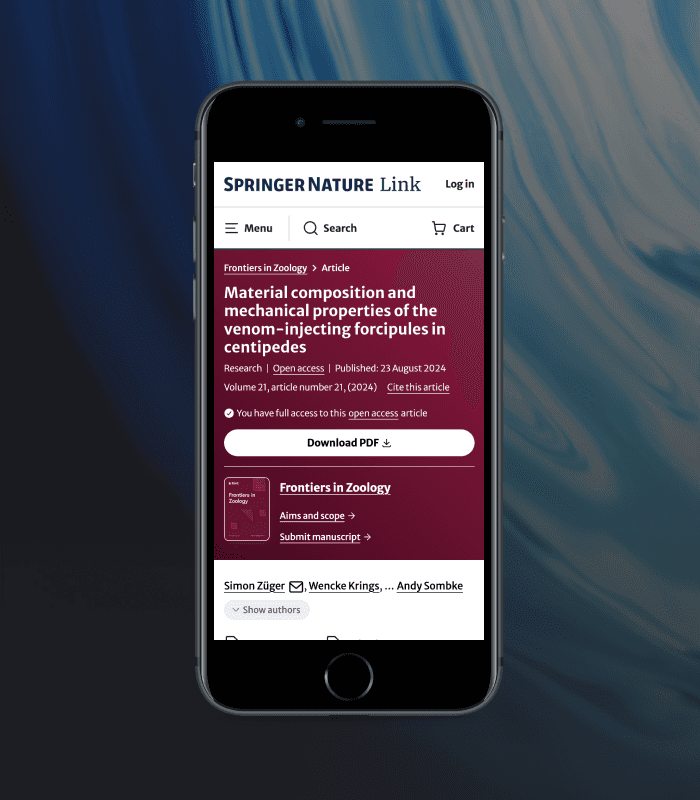
The introduction of a masthead improved scan-ability and navigation by surfacing metrics, CTAs, and structure where users expect them.

Mobile experience

Information architecture

New navigational elements improved wayfinding and discoverability by aligning labels, links, and hierarchy with user mental models.

Colour

Bold, accessible colour choices strengthened journal identity while staying compliant with WCAG contrast standards.

Iconography

Icons supported faster comprehension, but were intentionally paired with clear language to avoid ambiguity.

Desktop experience

E-commerce

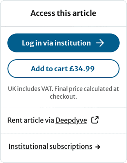
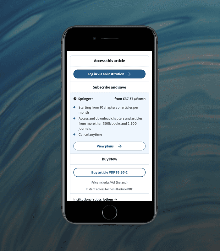
Cross-team collaboration ensured the purchase experience balanced usability, clarity, and conversion goals. User-tested buying journeys simplified decision-making through stronger hierarchy, clearer copy, and reduced cognitive load. Testing confirmed that clarity, consistency, and fewer choices led to better comprehension and usability.

Old buy box

New buy box

Final visuals

Open Access article page

Authentication/e-commerce journey

Article metrics page

A second iteration of the article page included designing an article metrics page to break down the influence and reach an article has achieved to date. Utilising colour, layout and iconography to clarify information for easy consumption.

Article metrics page

Success metrics

Design decisions were tied directly to user behaviour and business outcomes where the primary success metric was defined as an increase in discoverability between article-journal traffic. Secondary success metrics indicated an increase in article purchases, downloads, authentication and log-ins.

Outcomes

The redesign proved that user-centred design at scale can drive significant engagement, revenue, and cultural change internally. The design delivered measurable gains across engagement, revenue, and discoverability without harming core performance metrics including; +21% article purchases, +19% log-ins, +13% authentication, +47% journal traffic and +5% downloads.

Take a look at an article page!

Take a look at an article page!

Reflection

Icons alone don’t communicate intent - clear language, testing, and early validation are key to strong UX. Stress testing designs and analysing edge cases early ensures designing solutions with wider constraints and avoids designing under pressure later. Extensive user testing during the design concept phase supported design decisions for quick delivery.

Other projects

Interested in connecting?

Let’s talk projects, collaborations and opportunities to make a difference.

Book a call

Interested in connecting?

Let’s talk projects, collaborations and opportunities to make a difference.

Book a call

Interested in connecting?

Let’s talk projects, collaborations and opportunities to make a difference.

Book a call

Create a free website with Framer, the website builder loved by startups, designers and agencies.