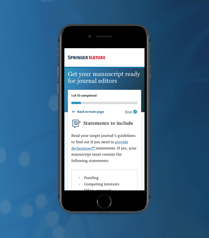
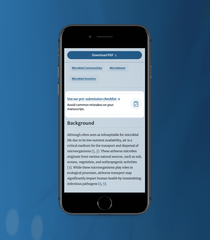
Manuscript preparation tool
An interactive tool designed with user-centred thinking to guide early career researchers through submission journeys with less friction.
Role
UI designer
Industry
Publishing
Duration
6 months • 2022


Overview
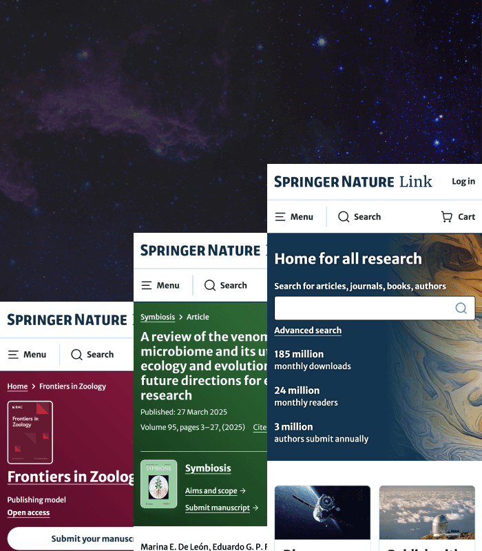
SpringerNature is one of the world’s leading academic publishers with over 1M daily users. Designed for science research publishing, a complex domain where clarity and accessibility are critical UX needs. As UI Designer, I focused on visual hierarchy, interaction design, and usability to bring the tool to life applying core UX principles - guidance, simplicity, and feedback - to help first-time authors navigate a stressful process. Over six months, the project followed an iterative design approach from discovery to delivery.
Want to see the live tool?
Features
The tool supports progress tracking, reduces cognitive load, and lets users complete tasks efficiently in one place.

Impact
Since implementation, the tool has improved real outcomes, increasing submissions, reducing rejections and earning strong user ratings, especially on mobile where usability really mattered.
Problem
Dense guidelines and high rejection rates created poor user experiences, so the challenge was simplifying complexity while meeting business goals.
Business goals
To educate users clearly and early so better understanding leads to better outcomes for both users and the business.
Design process
A dual-track process balanced discovery insights with delivering a functional, usable product on time.
Design goals
To build a simple, supportive, and intuitive experience to reduce stress and confusion.
Constraints
Limited testing time, domain learning curves, and split focus required pragmatic design decisions and a lean UX approach.
Hypothesis
Clear information and transparency would improve confidence and reduce submission errors.
Users
Early career researchers and first time authors where English may not be their first language.
User research
Stakeholder interviews helped uncover unmet needs and avoid reinventing existing solutions.
Key insights
Time
Lengthy guidelines negatively impacted education around processes.
Clarity
A lack of clarity around submission processes was found with users.
Support
Language support was essential.
Effort
Unnecessary effort was expended by users during the submission process.
Ideation
Framing problems as “How Might We” encouraged user-centred and solution-oriented thinking. My interactive dashboard concept was chosen to prototype and test for its strong alignment with visibility and feedback principles.