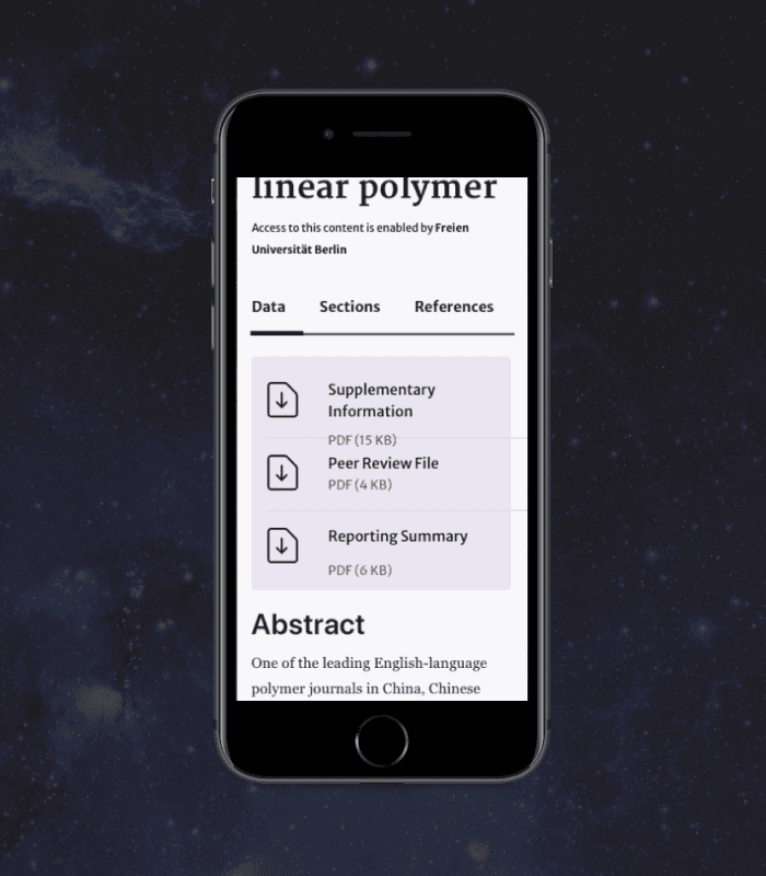
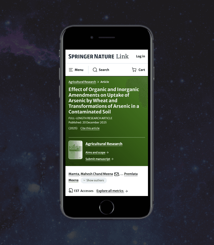
Researcher-centric platform
Bringing multiple brands together into one clear, consistent, and user-first experience.
Role
UI designer
Industry
Publishing
Duration
6 months • 2023

Overview
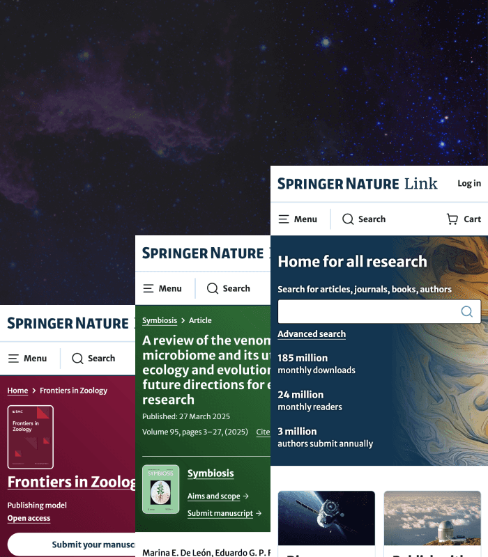
SpringerNature is one of the world’s leading academic publishers with over 1M daily users. Designing for science research publishing meant designing for trust, credibility, and heavy content without overwhelming users. At massive scale, this researcher-centric platform redesign unified branding, identity, and UX to reduce friction and improve clarity. The project moved from exploration to validation with a strong focus on iterative design and testing, culminating in the article page redesign where I applied all research, testing results and insights from this work.
Want to explore the platform?
Wait, what is Open Access?
Open Access is a publishing model with free to read research. SpringerNature boasts thousands of open access articles, journals and books.
Features
The new layout, colour system, and iconography improved visual hierarchy, brand consistency, and wayfinding across the platform.


Nature article syndication
Impact
The redesign boosted brand perception, simplified journeys, and increased transparency around article evaluation, content discovery and publishing routes.
Problem
Academic publishing is in a period of disruption - researcher satisfaction is at an all time low as they face too many tasks and obstacles to publish. Fragmented domains and complex publishing flows were hurting usability and negatively affecting submission rates and discovery, so the core problem was reducing cognitive load without losing brand trust
Business goals
To create a seamless, collaborative platform that allows researchers to focus on content discovery and publishing routes instead of navigating friction.
Design process
User-centred design processes involving research, concepting, testing, and iteration ensured decisions were validated and evidence-led.
Design goals
To clearly translate brand characteristics into scalable UI patterns that designers and stakeholders could align on.
Constraints
With brand elements locked, the challenge was applying UX principles effectively within design boundaries.
Hypothesis
If the platform became more holistic and user-centric, engagement, discoverability, and brand perception would improve.
Users
Early-career researchers and first time authors where English may not be their first language.
User research
Existing user research pointed to frustrations around discoverability and wayfinding, comprehension of publishing models and confusion around article evaluation.
Visual research
Mood-boarding helped translate abstract brand traits into tangible UI principles like spacing, colour, typography, and structure. SpringerNature's five brand characteristics are; friendly, transparent, progressive, simplified and confident.

Mood board for SpringerNature brand characteristic transparent.
Brand
Competitor analysis informed how whitespace, tone, and visual restraint ladder up to clear brand perception.
Platform vs multiple brand relationships
Exploring platform-brand relationships helped balance consistency with differentiation across imprints.
Spotify
Spotify’s colour-driven content inspired a scalable way to reflect journal identity within a unified system.

Spotify playlist with album branding
Design concepts
Multiple concepts explored how layout, colour, and hierarchy could modernise article pages while respecting user expectations.
Layout
Gestalt principles like symmetry, proximity, and similarity guided layout experiments to improve readability and navigation.


Gestalt principle: symmetry
Colour
Gradients and pastel tones were used strategically to express brand personality without overpowering content.